Choosing Colours for The Cedar River Blanket
Perhaps the biggest discussion going on in the Deramores Cedar River CAL group on Facebook is what colours to use.
Man, I am with you, choosing colours is hard. I am notoriously picky about (well, everything) but especially colour. I think that its one of the reasons I stick so closely to a strong pallet is that I know what I like and I don't want to alter it in ANY WAY, but...you know, not everyone wants to use mustard in every design (who are these strange people?).
I thought I would show you some of the development of the colours in the blanket. The Cedar River blanket was originally intended to be a rainbow extravaganza. This is the original mood board I sent to them as part of my proposal.
I still think the rainbow would be incredible, but at the time I was making it, one of the blues was low on stock and the rainbow had to be shelved.
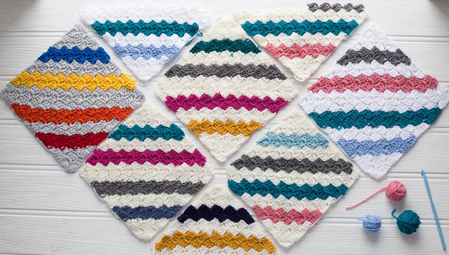
Heading back to the drawing board, I then began playing with the colours. I find it very hard to decide upon colours and one of the main reasons I fall terribly behind in my work is that I have a tendency to remake things because I am unhappy with the colour combinations. This design was no exception...I made about 9 different variations, often making 2 or 3 of the same block to get a sense of how they fit together.
My original plan was to have alternating squares as shown on the left. This is pretty common in string quilts and in fact, we were just about on the point of putting the blanket together when we made the decision to have the squares all the same. This is what creates the strong geometry of the finished design.
So, how then do you go about choosing colours...for me, I think its about finding frame of reference...something in my house or life that I love and matching that. Design Seeds is another great colour resource.
I hope that helps the indecisive among you! The full range of the Deramores Studio Range is here and you can find the 2nd part of the tutorial for making the blanket here.


